A redesign for the invoices module in Sobrus Pharma that reduced invoice creation time, saving pharmacists both time and stress.
Challenge
How can we enhance the invoice creation interface to make it more user-friendly, efficient and time-saving?
UX Design, Research, Interaction Design, Prototyping, Usability Testing, Visual Design
2024
Context
What is Sobrus Pharma?
Sobrus Pharma is a SaaS platform designed for pharmacists, aimed at improving and simplifying the management of their pharmacies.
And the invoices module is the most crucial module of Sobrus Pharma platform, as pharmacists spend 80% of their time using it while working with our software.
Problem Definition
User problem:
The way products are displayed in the cart after being added from a prescription. Currently, the most recently added product appears at the top of the list. This arrangement causes problems when users review the invoice, as it doesn't match the order of items on the prescription.
Business problem:
Inefficient Invoices Module Impacting Pharmacists Sales Performance and user Satisfaction
Discovery
Highlights:
We gathered valuable insights through customer support, and user research
Most of our users search for products by name or scan the item they have in hand.
Out of every 5 invoices, 2 contain long product lists (more than 5 products) created by pharmacists based on the prescriptions they receive from their patients
Every time the user adds a product to the sale, they have to open an accordion to select the quantity. this process becomes complicated and time-consuming when dealing with a long list of products
Mapping the experience:
We mapped out the experience of the user to help us visualize our user's journey, spot opportunities for improvement, and ideate a future state for the experience.

Link to the experience map
Based on the user research and the experience map these are the pain points that we will be focusing on
The recently added product appears at the top of the list. This arrangement causes problems when users review the invoice.
The pharmacist has to open each product accordion to add quantity, which is time-consuming and frustrating process
When the pharmacists is directed to a new page to enter the chosen payment method, they sometimes need to edit or verify the ordered products. this requires them to navigate back and forth between pages
Ideation
My PM and I collaborated on ideating and sketching some concept based on our findings from user research and the experience map.

After finishing the sketches and agreeing on the concept, I prototyped the chosen design so we can test it with our users and these are the issues addressed:
The recently added product appears at the top of the list
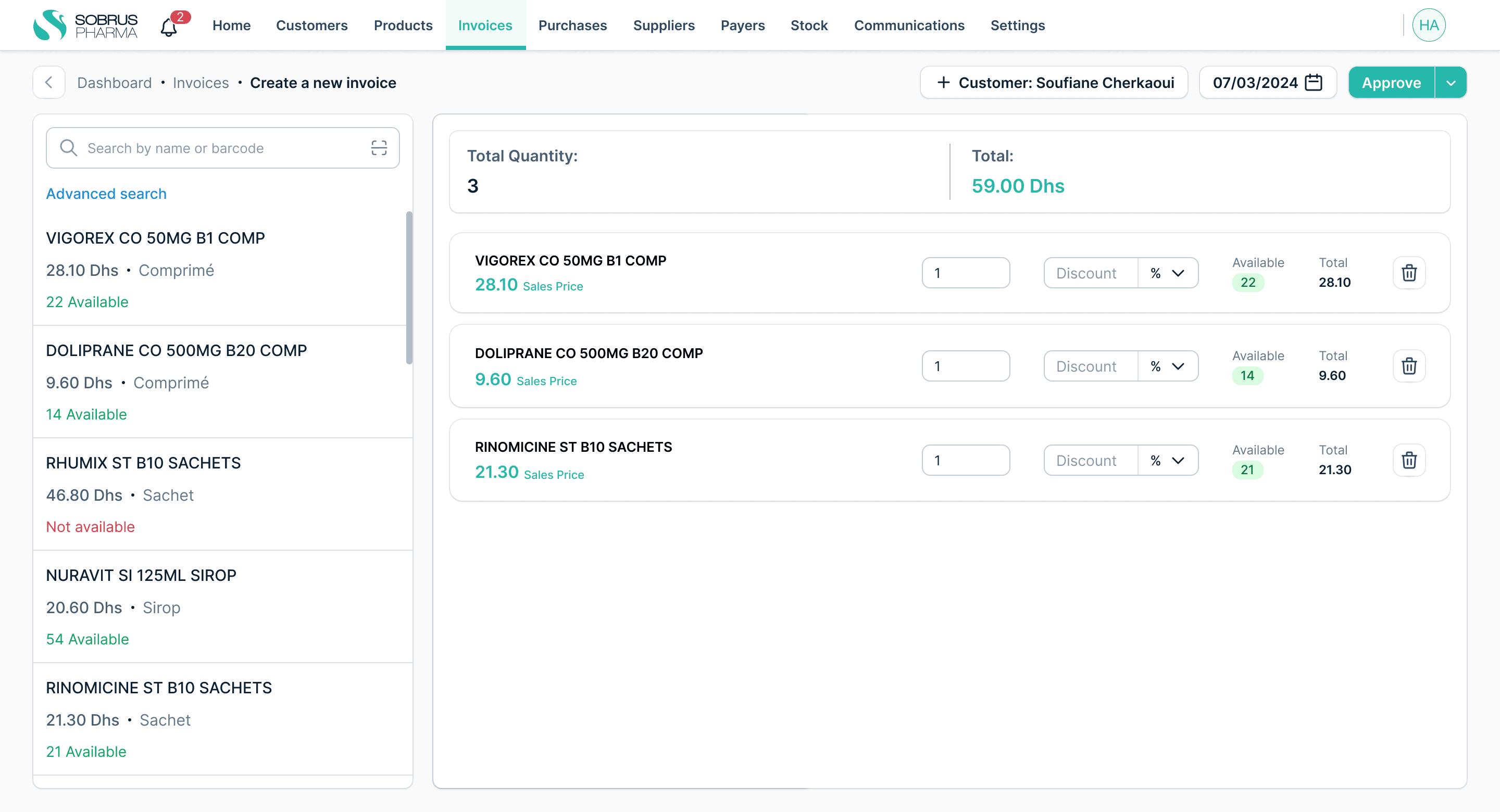
We addressed this issue by removing the left panel, as it was rarely used. The panel was only necessary when a product's barcode wasn't in our database, forcing the pharmacist to search for the product by name.
The pharmacist has to open each product accordion to add quantity
After removing the left panel, we created significantly more space in the main section. This allowed us to include all the input fields directly in the table without hiding them inside an accordion.
The pharmacists is directed to a new page to enter the chosen payment method
We addressed this issue by eliminating the separate payment method page and replacing it with a slide-out panel that overlays the invoice. This design choice allows the user to easily access payment options without leaving the invoice view. Additionally, the slide-out can be quickly closed, enabling the user to verify ordered products or any other information on the invoice without interruption.
Usability test
After my PM and I conducted a series of usability tests, we were able to evaluate our design and the modifications made to the invoices module. This process allowed us to identify key areas of improvement and gather valuable insights.
Main Key Insights
it is more efficient for the pharmacist to select each product individually, add the desired quantity, and assign any applicable discounts one at a time.
The "Add products" button is not very prominent, making it difficult for users to quickly locate it when they need to add more items.
Users found the product selection modal cluttered and overwhelming. The search filters (NNI, Sales price, Galenic form) take up too much space and are rarely used.
After years of using our system Users have already formed a mental model of how our system works, Introducing this change may disrupt their workflow, causing confusion or annoyance. “ we got used to using the left panel to search for products, Changing this will make the search process ambiguous and significantly make our process of creating an invoice a lot longer” a pharmacist said.